How to Generate Better Spatial Data Visualisation

Data visualisation of London


ONLINE 

This three-class course will cover the basics of producing good spatial data visualisation.   

Attendees will be guided step by step on how to produce effective map visualisations with QGIS. During the three meetings we are going to cover the following topics:
 

Getting Started:

1. Brief familiarization with QGIS, installing plugins and web base maps.   

2. A review of cartographic and visualisation principles to be reinforced with each exercise.   

Visualising Point Data: Bringing in a point data file from excel and exploring more advanced cartographic styles.   

1. Proportional Symbols   

2. Heat Maps (turning points to raster surfaces)  

     a. Basic for visualisation   

     b. Advanced for analysis   

3. Turning points into choropleths   

     a. Counting points within boundaries and grids  

     b. Normalising and Visualising the results   

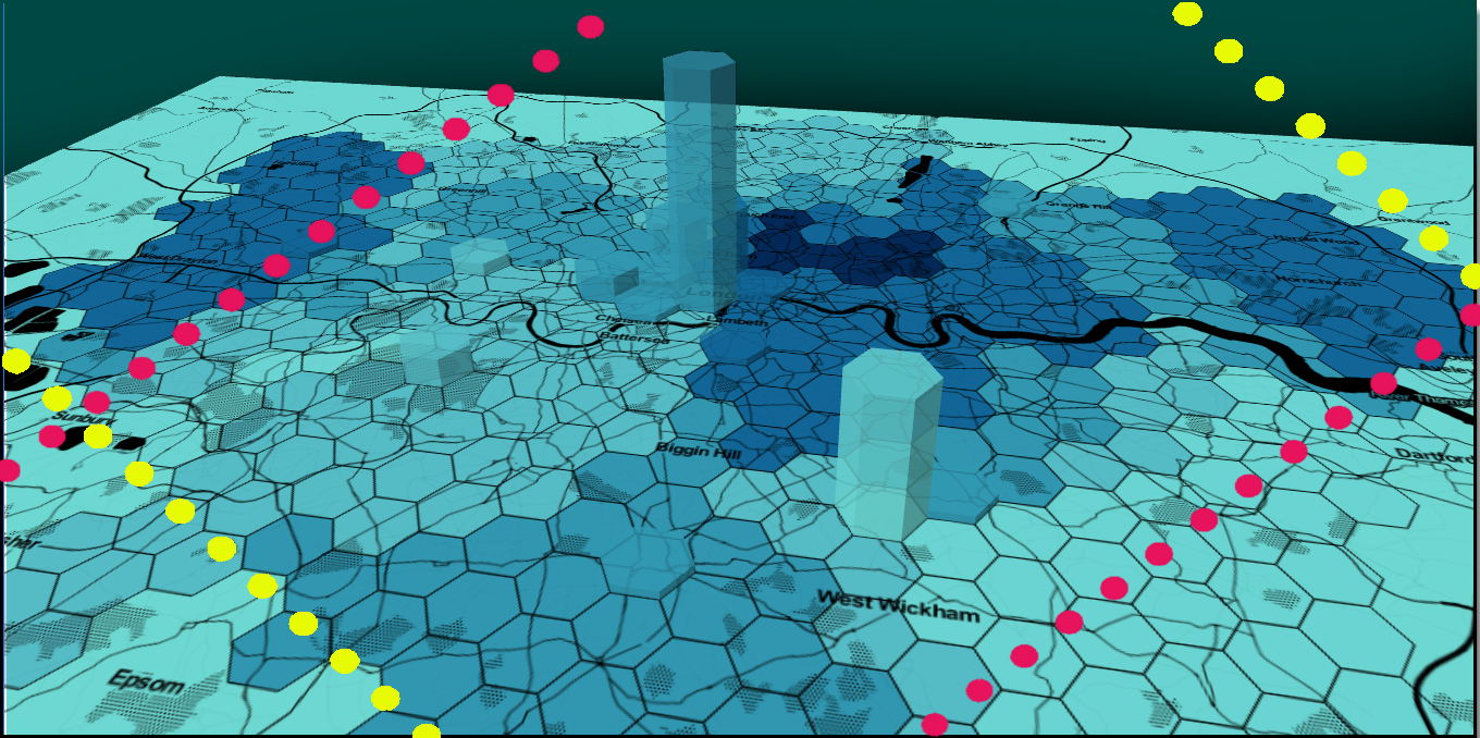
Visualising Area Data:  

1. Hexmaps / Cartograms  

2. Dot Density Maps   

3. Prism Maps (3D)   

Temporal Mapping: Using QGIS’ temporal controller to show a change in data.   

1. Animating Points   

2. Animating Heat maps   

This is an intermediate-level course. Intermediate sessions explore specific aspects of the method (libraries, tools etc.) and offer a more in-depth understanding of the course topics, without introducing the basics. Some knowledge on geographical information systems is required to be able to follow the content.  

Those who have registered to take part will receive an email with full details and a link to join the session in advance of the start time.  

After taking part in this event, you may decide that you need some further help in applying what you have learnt to your research. If so, you can book a Data Surgery meeting with one of our training fellows.  

More details about Data Surgeries.  

If you’re new to this training event format, or to CDCS training events in general, read more on what to expect from CDCS training. Here you will also find details of our cancellation and no-show policy, which applies to this event.  


If you're interested in other training on geographical data analysis, have a look at the following: 

Return to the Training Homepage to see other available events.

You might be interested in

Graphic for a workshop titled ‘Text Classification in Practice: From Topic Models to Transformers.’ The background shows handwritten historical letters. A large green ampersand featuring an illustration of Ada Lovelace is placed on the left. The logo of the Centre for Data, Culture & Society (DCS) appears in the top right corner.

Text Classification in Practice: From Topic Models to Transformers

Graphic for a workshop titled ‘Working Collaboratively Through Version Control.’ The background is a black-and-white photograph of people weaving on large looms. A large magenta ampersand featuring an illustration of Ada Lovelace is placed on the left. The logo of the Centre for Data, Culture & Society (DCS) appears in the top right corner.

Working Collaboratively through Version Control

a yellow tinged photo of people entering a building, with the text "Brad Rittenhouse, Project Deep Dive"

Giving Humanists a Helping Hand in HPC

Graphic for an event titled ‘BYOD Festival.’ The background is a black-and-white photograph of people sitting around a table, drinking tea and playing cards. A large magenta ampersand featuring an illustration of Ada Lovelace is placed on the left. The logo of the Centre for Data, Culture & Society (DCS) appears in the top right corner.

Bring Your Own Data (BYOD) Fest

Graphic for a workshop titled ‘Introduction to Geographical Data with QGIS.’ The background shows an old map of the world with detailed illustrations. A large teal ampersand featuring an illustration of Ada Lovelace is placed on the left. The logo of the Centre for Data, Culture & Society (DCS) appears in the top right corner.

Intro to Geographical Data with QGIS

Graphic for a workshop titled ‘Foundations of Sentiment Analysis.’ The background is a sepia photograph of people working at desks in a large hall with overhead lamps. A large green ampersand featuring an illustration of Ada Lovelace is placed on the left. The logo of the Centre for Data, Culture & Society (DCS) appears in the top right corner.

Silent Disco: Foundations of Sentiment Analysis

Graphic for a workshop titled ‘Getting Started with Descriptive Statistics.’ The background is a black-and-white photograph of people reading and working in a library. A large magenta ampersand featuring an illustration of Ada Lovelace is placed on the left. The logo of the Centre for Data, Culture & Society (DCS) appears in the top right corner.

Getting Started with Descriptive Statistics

Graphic for a workshop titled ‘Using API for Research.’ The background is a black-and-white photograph of people working with printing equipment and patterned sheets. A large magenta ampersand featuring an illustration of Ada Lovelace is placed on the left. The logo of the Centre for Data, Culture & Society (DCS) appears in the top right corner.

Using API for Research